Website Design for
HVA.com
The HVA
HVA is a nonprofit group that offers online services to support veterans.
They focus on building a community to help prevent veteran suicide and deal with healthcare issues.
They focus on building a community to help prevent veteran suicide and deal with healthcare issues.
Scope
Redesign HVA's official website to make it feel trustworthy and secure, while also giving it a strong brand appearance.
The previous website used a simple WordPress theme and needs a fresh update.
The previous website used a simple WordPress theme and needs a fresh update.
Role
UX Design, Brand Design, Information Architecture
Work closely with CEO and front-end engineers.
Work closely with CEO and front-end engineers.

The Task
The previous website's basic WordPress design doesn't make HVA stand out. So, one of the goals is to redesign the website to make it more consistent with HVA's values.
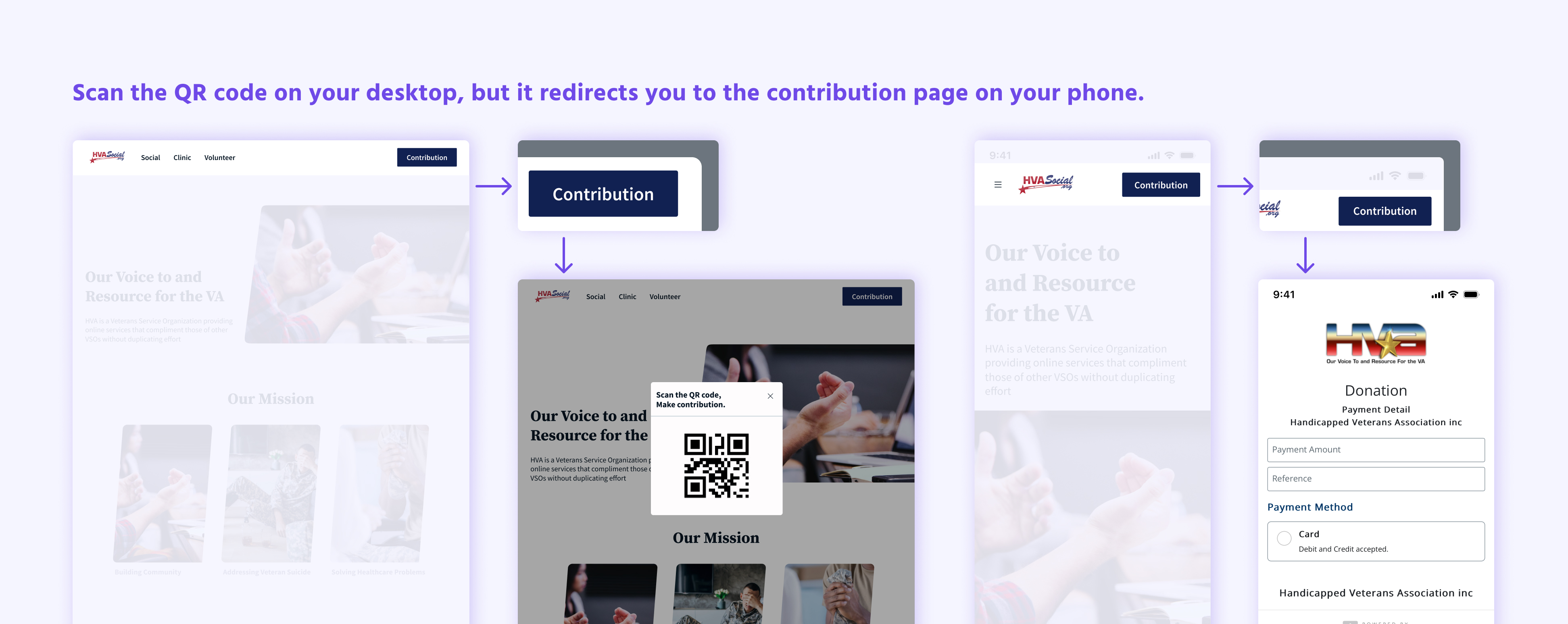
Making sure it's safe and trustworthy for users is crucial because the HVA will invite users to make contributions through the QR code on this site.
Additionally, all pages displayed duplicate information.
Inspiration & Process
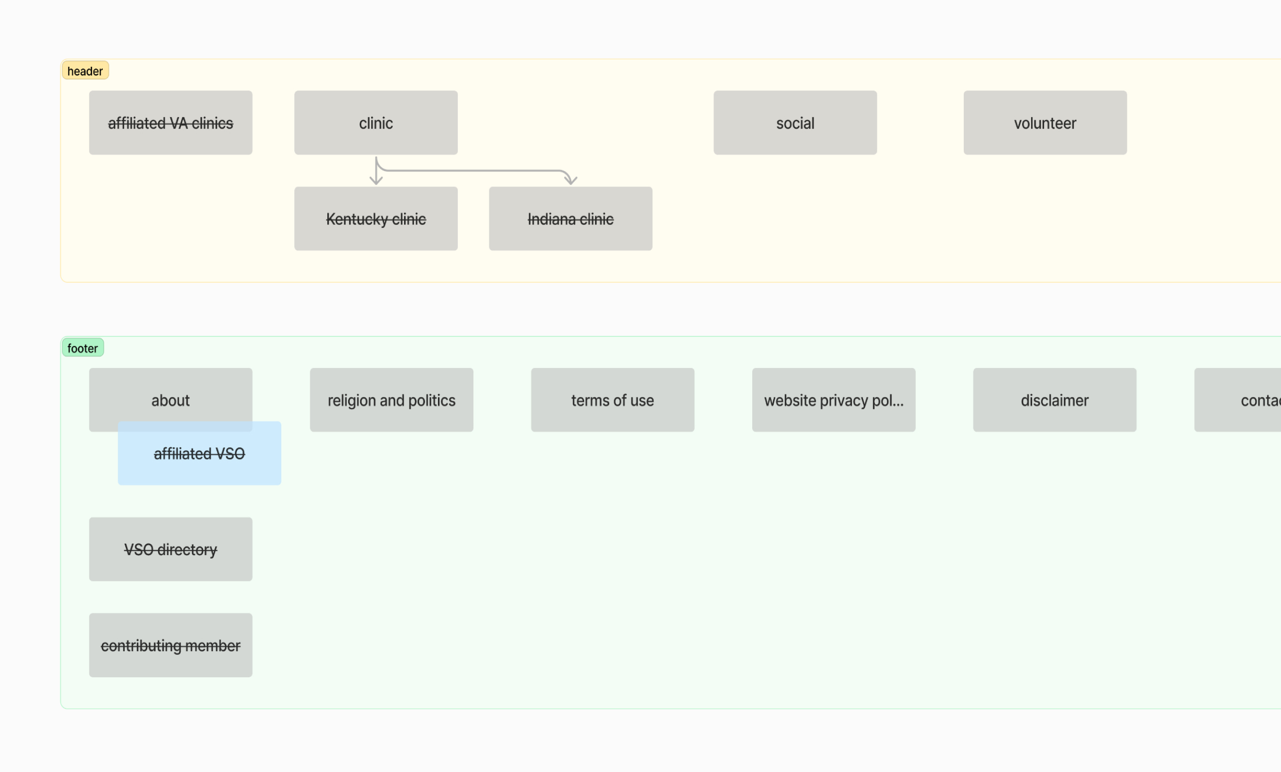
Before I dived into the pixels, I structured the information architecture to ensure that all information was relocated in a way that makes it easily understandable for users.
Added badges to new features to inform users.
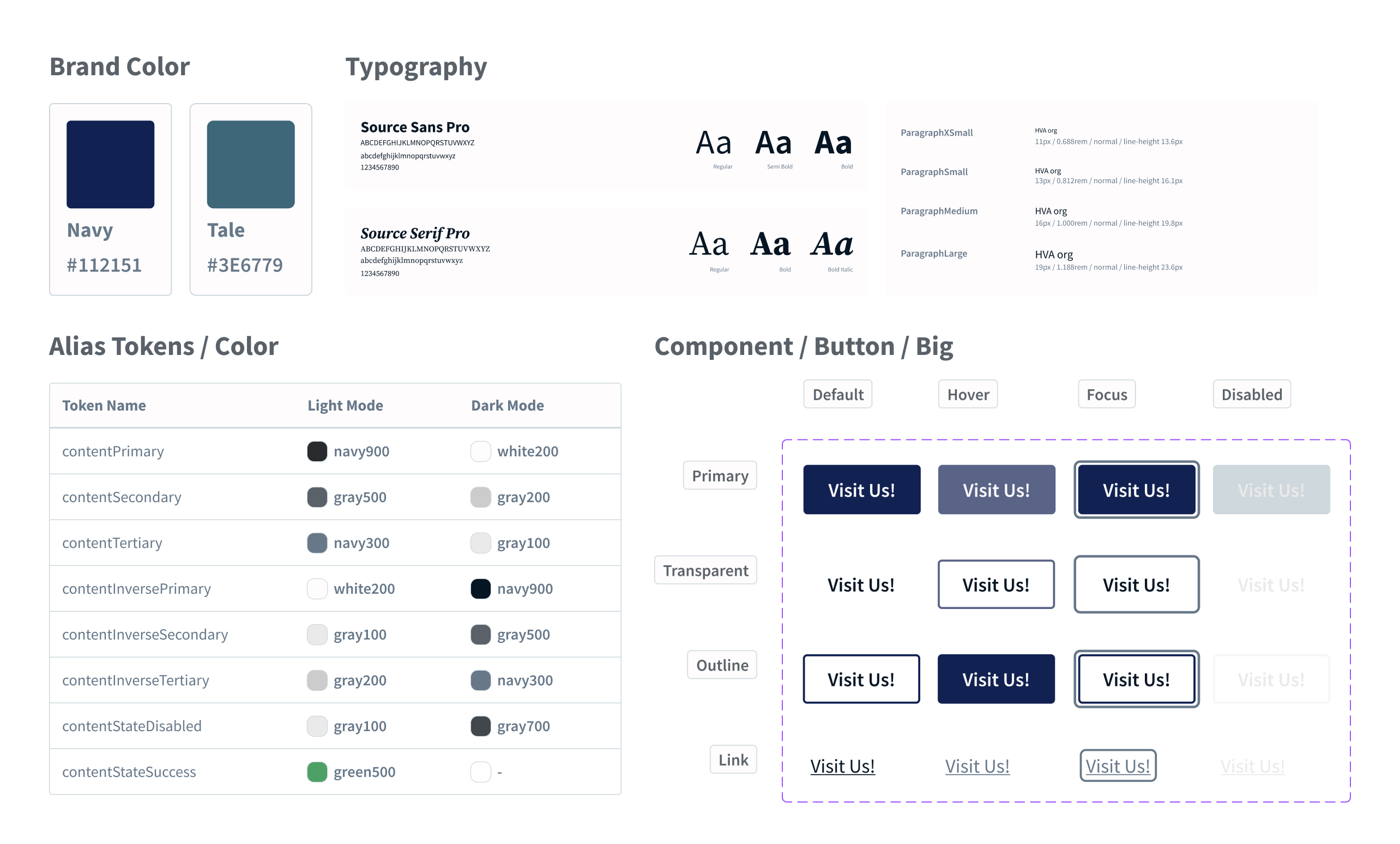
Align with A.S.O.'s design system color palette.
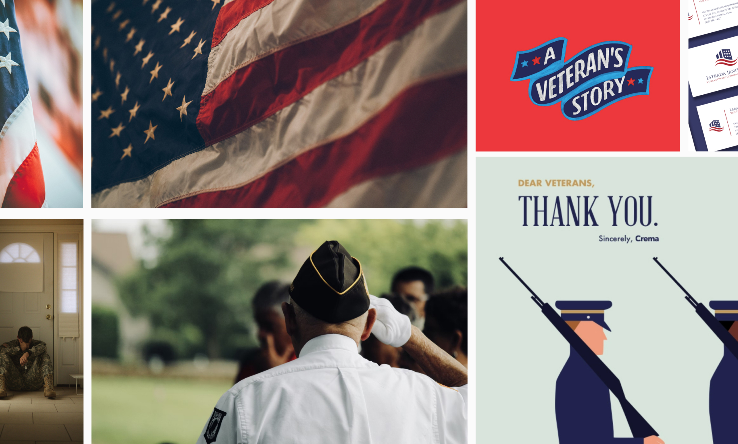
In this case, the mood board served as a communication tool, helping convey the intended look and feel of the website design in a visual way. We all agreed with a minimalistic design and military-inspired colors.
As the logo cannot be changed, I selected navy blue from the logo and incorporated it as the baseline color scheme to evoke a sense of stability and trustworthiness.
I built up a design system, including typography, icon, color and components to maintain consistency throughout the website.
📣 Big shoutout to Figma – Variables are awesome!
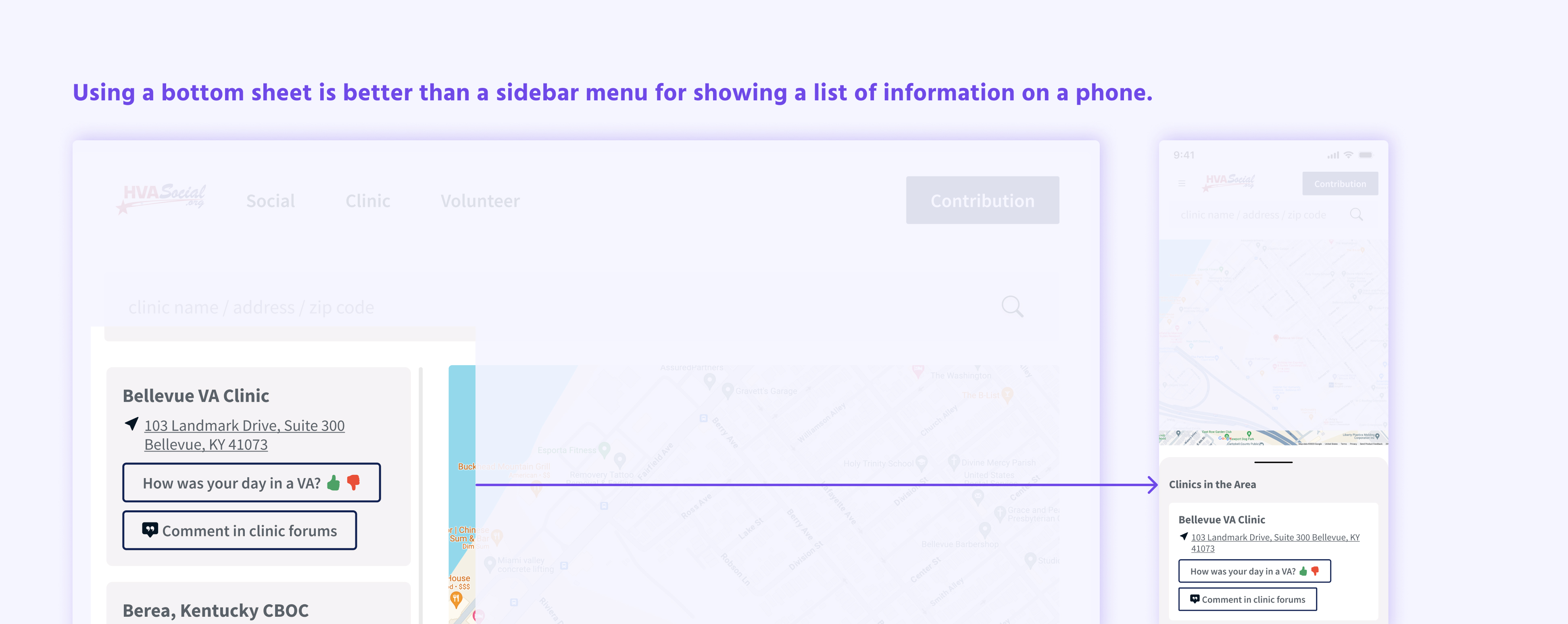
Pixels and RWD
When considering pixels and responsive web design (RWD), it's crucial to ensure that every element on the website adapts seamlessly across various devices and screen sizes. Here are the final designs.
View Prototype
Handoff
Collaboration between designers and engineers is key. Before handing off my design, I ensured smooth handover by renaming layers, organizing screens according to the user flow, and finalizing all prototypes.
Takeaways
Collaborating directly with Chuck, the CEO, was an enriching experience characterized by clear and efficient communication.
Moreover, the seamless collaboration between front-end engineers and myself, all well-versed in the open-source framework Bootstrap, facilitated a smooth workflow devoid of unnecessary back-and-forth.
I always enjoy creating design systems from scratch; elevating the quality and cohesiveness of work is everything to me!