Team Time!
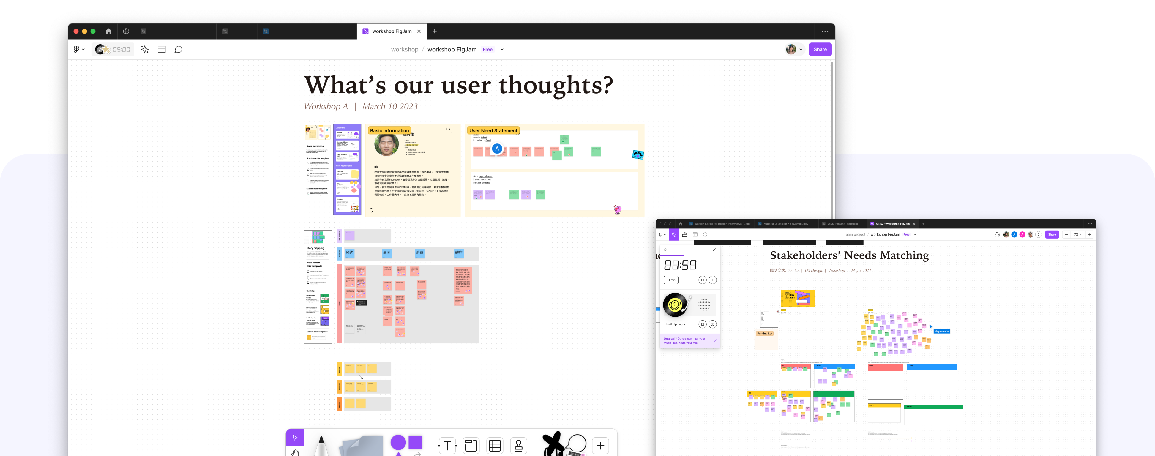
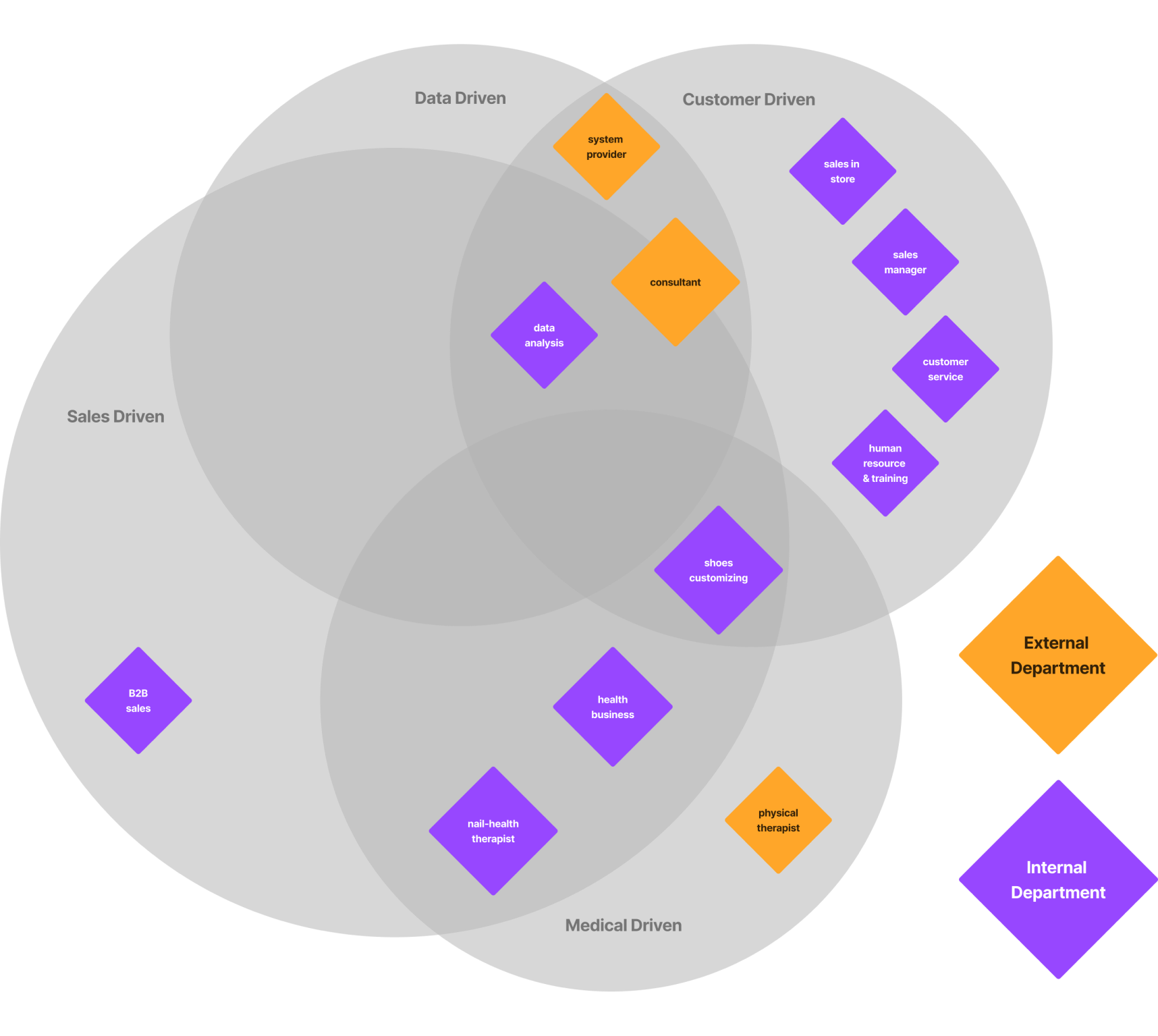
I'm thrilled to announce that this project will be joined by four interns. I firmly believe that great design thrives on collaboration. Despite pandemic challenges, I organized two workshops to foster trust and encourage open communication, empowering each team member to share their thoughts and aspirations.
User Flow
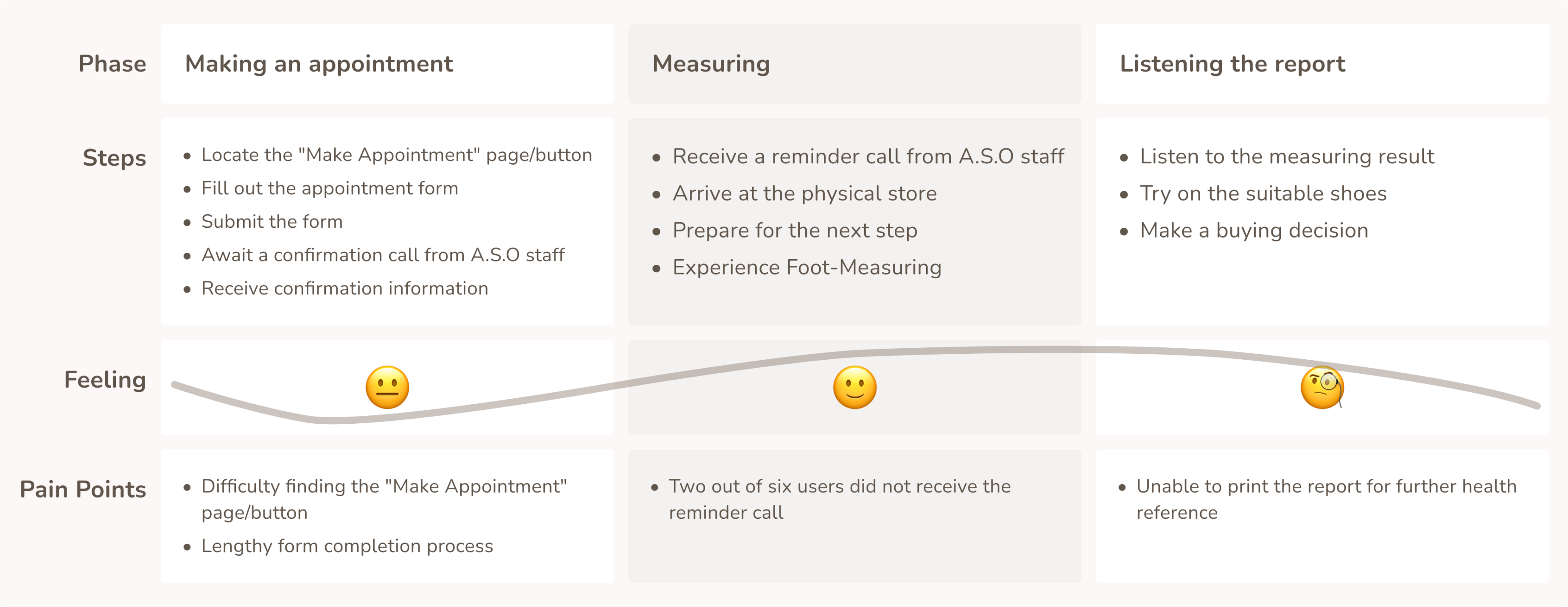
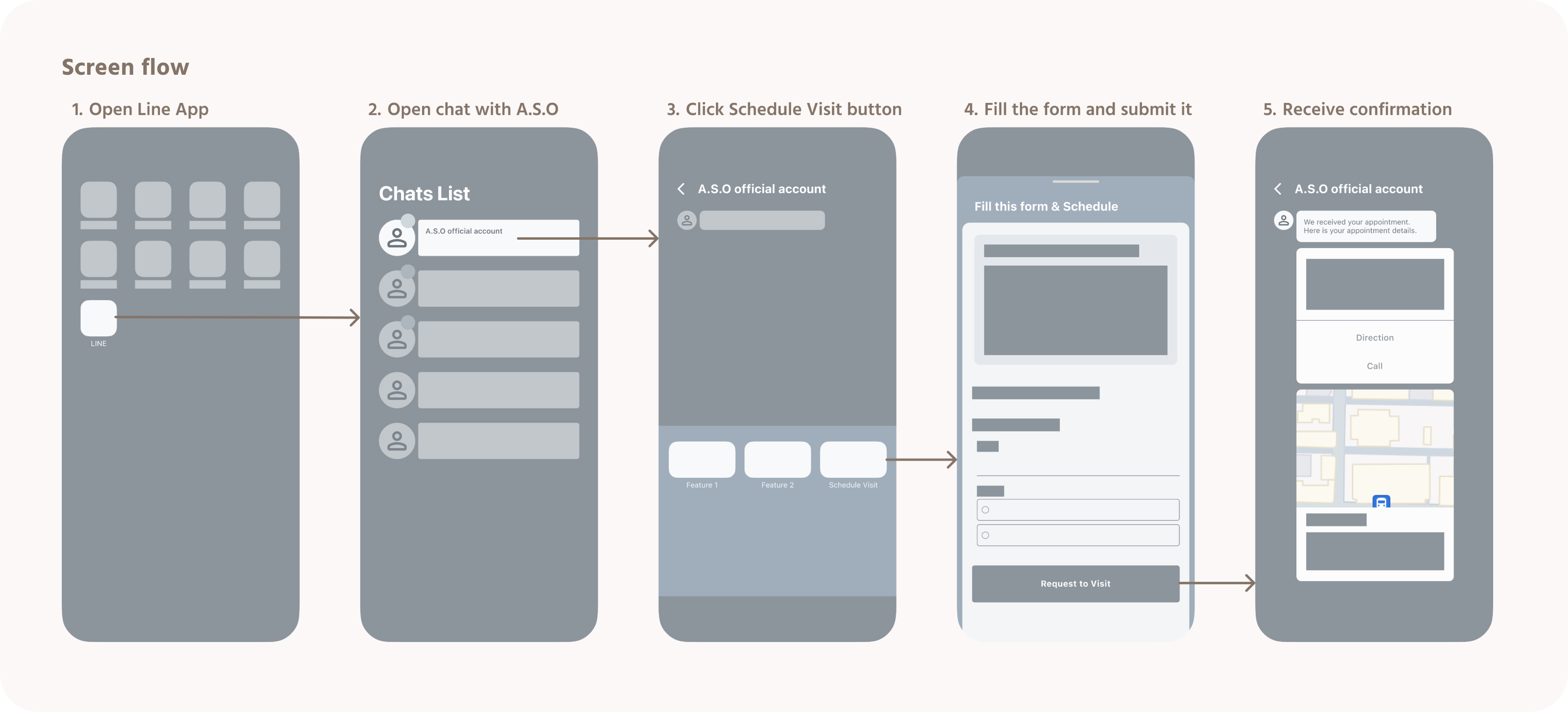
I organized the flow of the "making an appointment" stage to examine the difficulties users encounter from a more micro-level perspective. Next, we created a new user flow and communicated it with the engineers to ensure that the proposed new user flow could be implemented.
Design
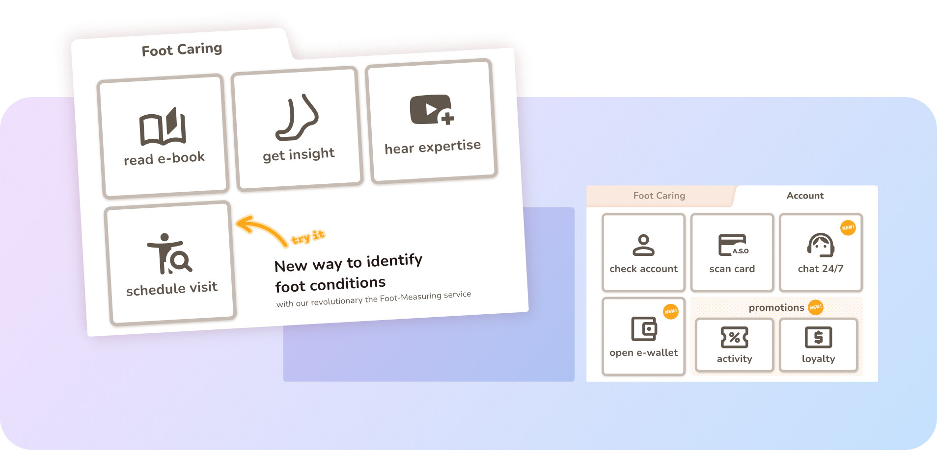
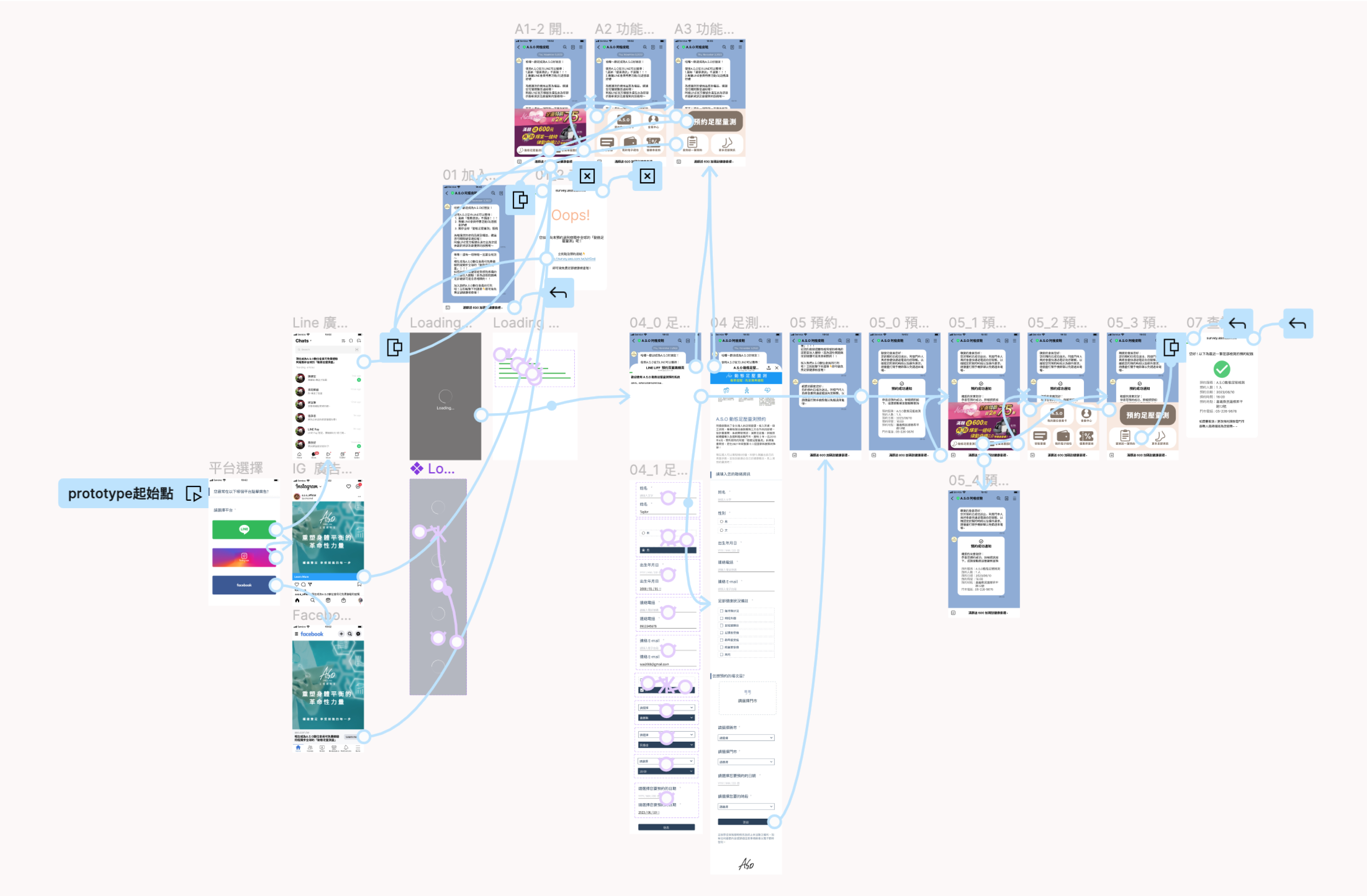
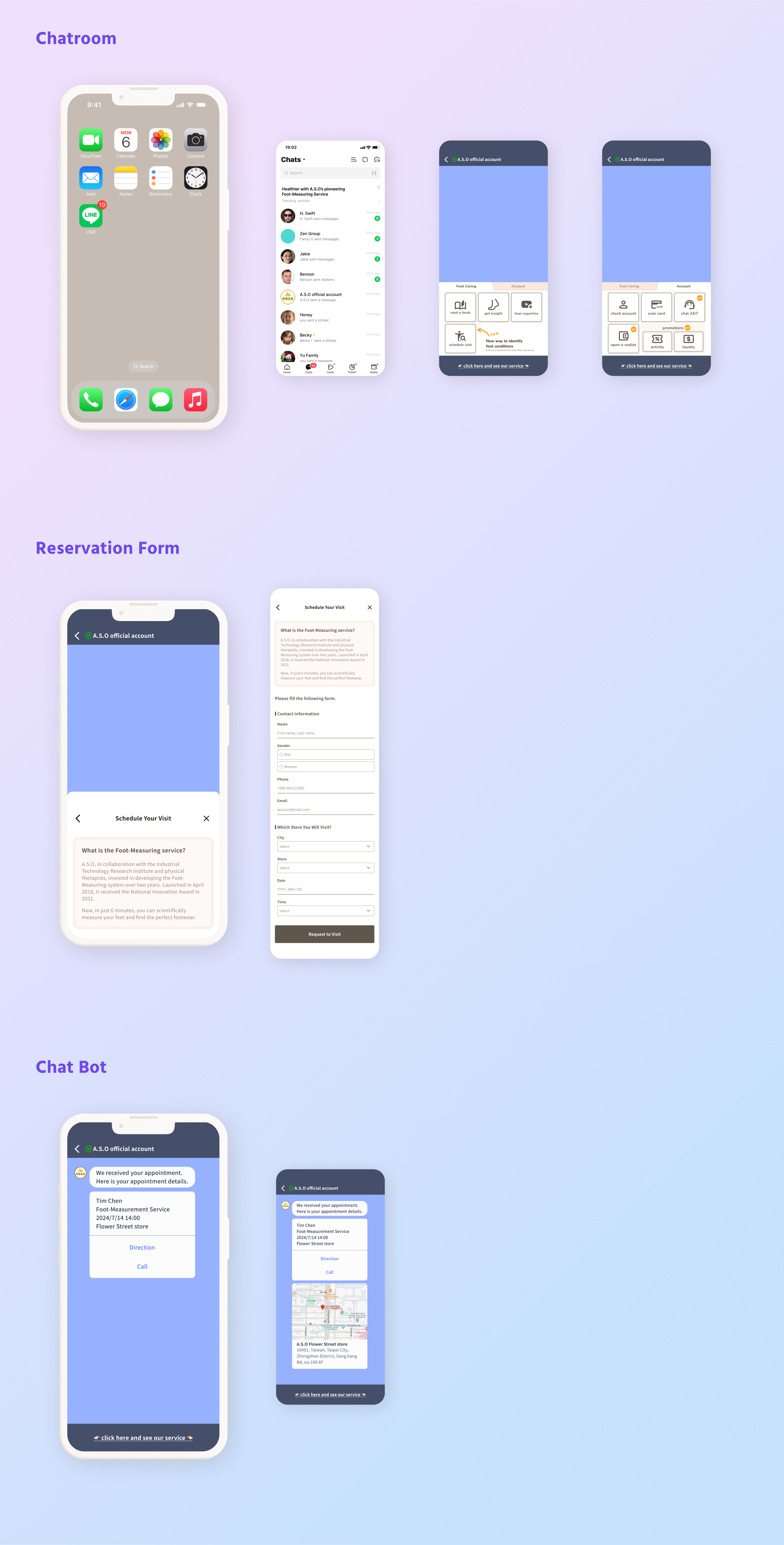
Interns followed the user flow, translating it into wireframes and then into interactive, high-fidelity screens. Iteratively refining through usability tests was integral in enhancing the overall user experience.
Testing
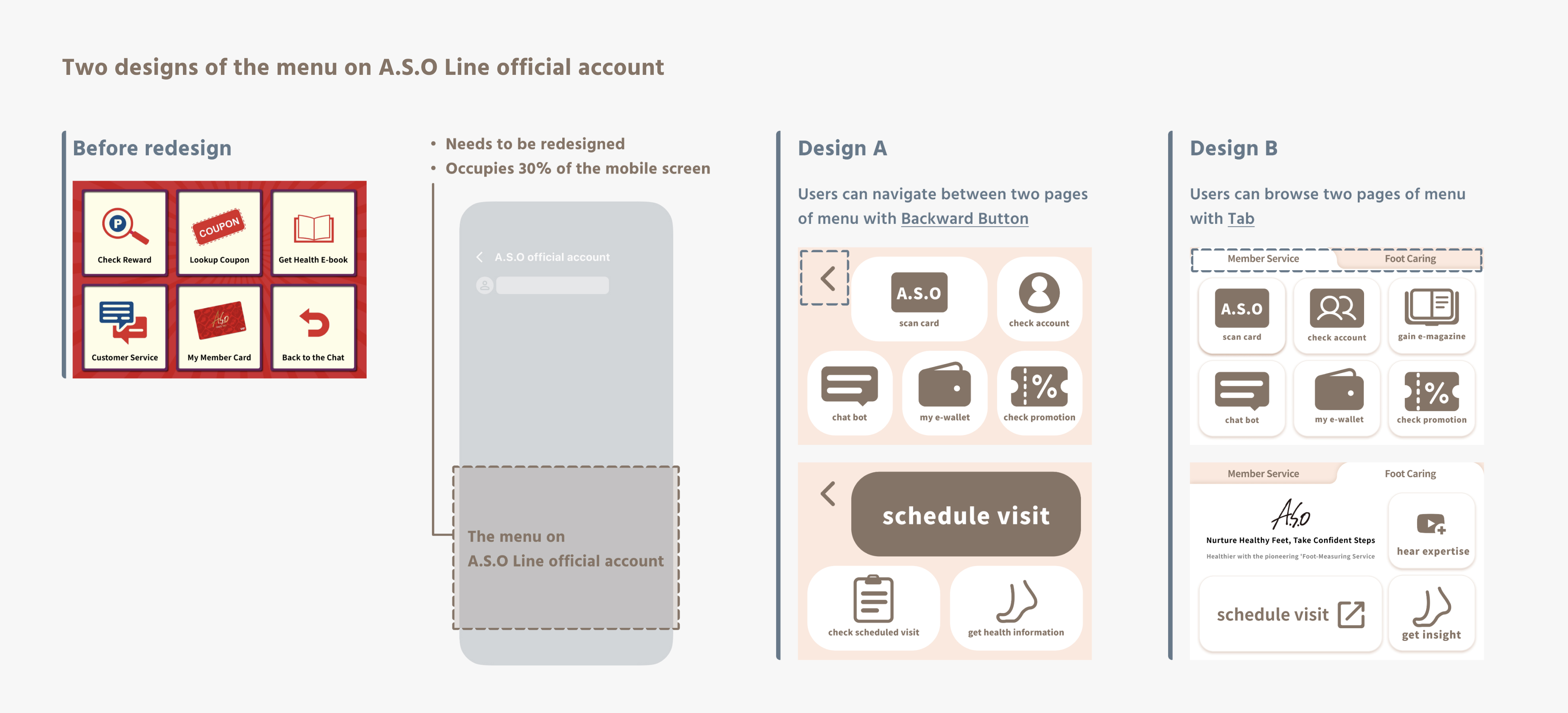
We tested both design A and design B to determine which one is more intuitive for users.
Think Aloud
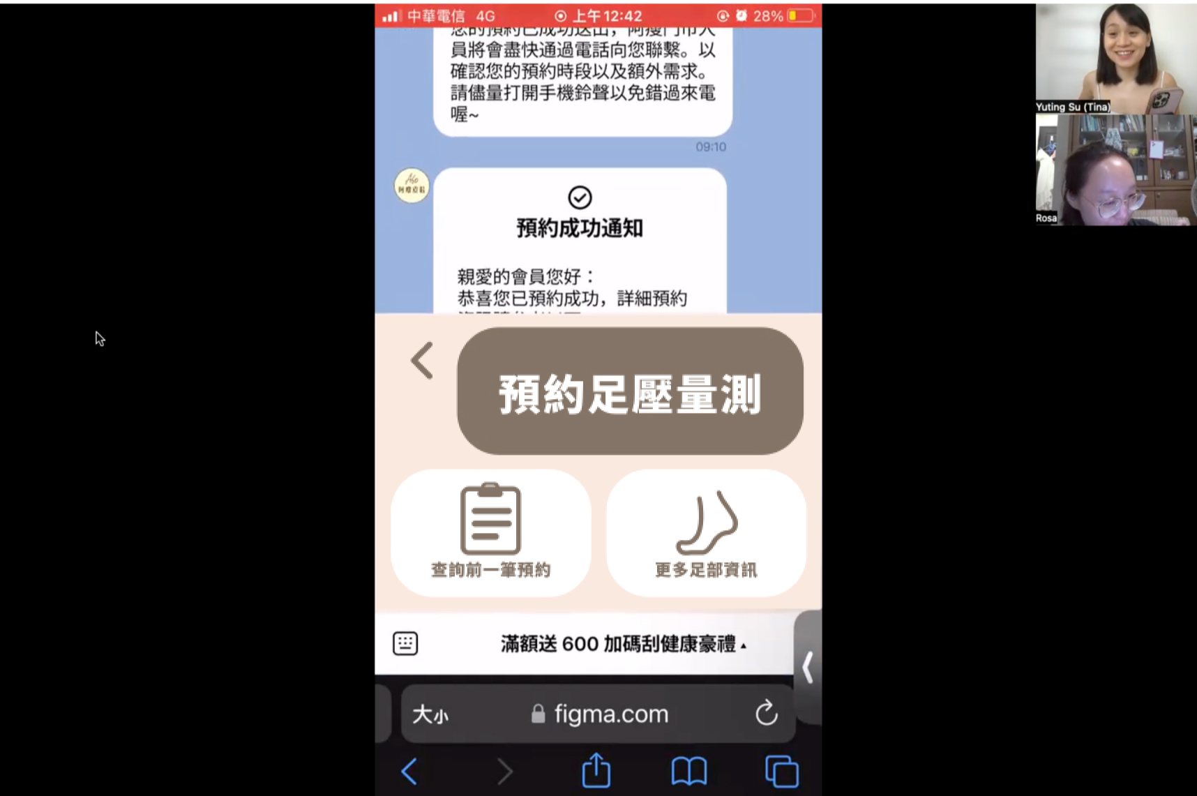
During the testing phase, my team employed the "think out loud" methodology, encouraging users to vocalize their thoughts and reactions as they interacted with the prototype.
This approach provided valuable insights into user perceptions and helped identify areas for improvement in the user experience.
“ This (booking) button looks like different from others, is it a title? Can I click it? ”
— Design A
SUS Survey
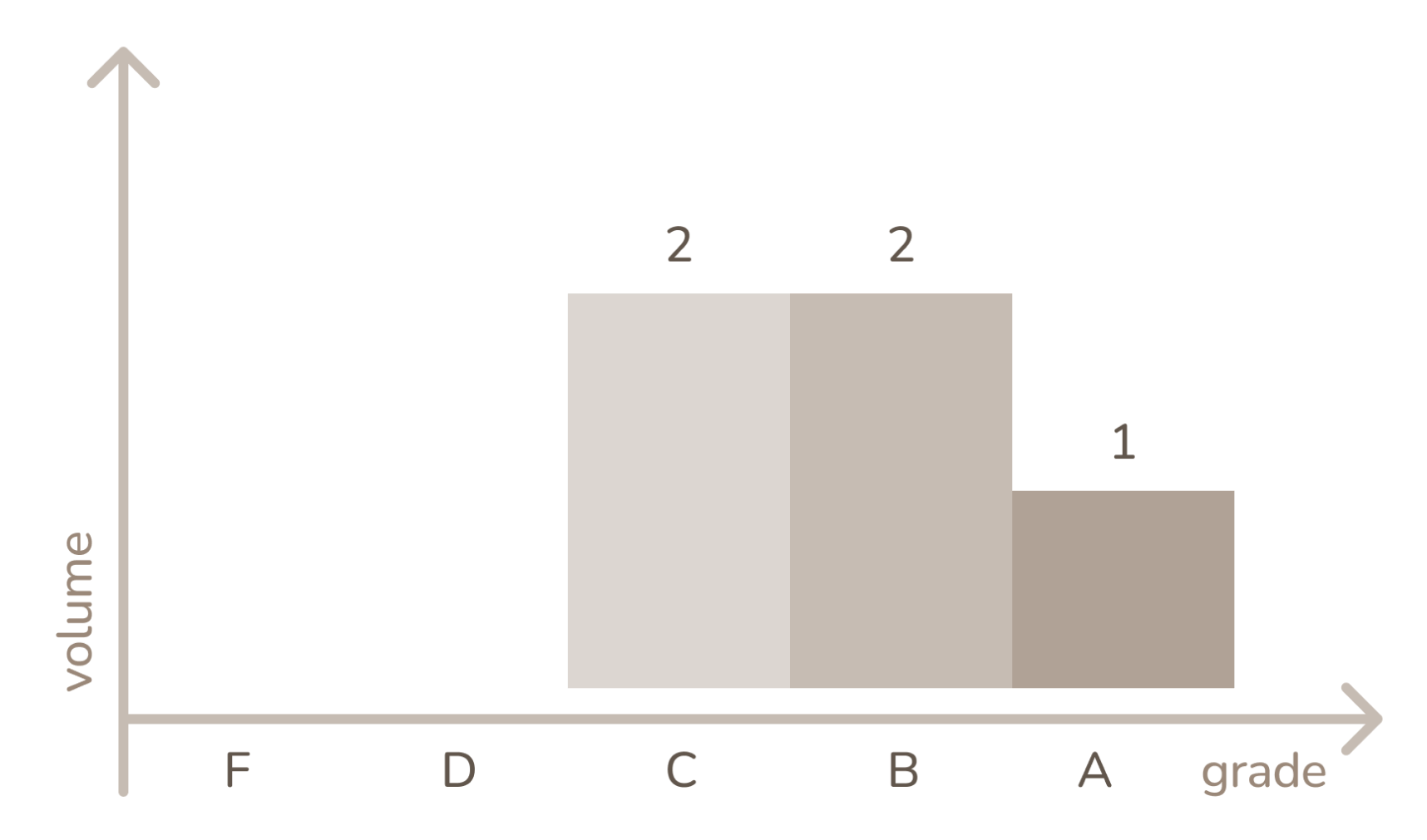
The results of the System Usability Scale (SUS) survey indicated that out of the participants, two fell within Grade C, two within Grade B, and one participant achieved a Grade A, providing a perfect score of 100.
While the overall feedback suggests a generally positive user experience, it is evident that there are areas in the design that still require optimization.
Findings
“ I enjoyed the booking process. It’s easy and all happened in a warm chat. ”
Users prefer seamless chat-based booking
This positive feedback suggests that emphasizing chat-based interactions could enhance overall user satisfaction.
The form should consider the user with mobile
This insight underscores the need to optimize the appointment booking form for mobile users, acknowledging the growing importance of mobile accessibility.
Consistent design for the booking button
This finding emphasizes the importance of maintaining visual consistency across the user interface, ensuring that the "booking an appointment" button harmonizes seamlessly with the overall design, enhancing user recognition and navigation.
The goal was 95%.
100%
Success Rate of Usability Test
↓ 48%
Task Time
The goal was decrease 25%.
Updated Release
We went with design B due to its consistent visual design.
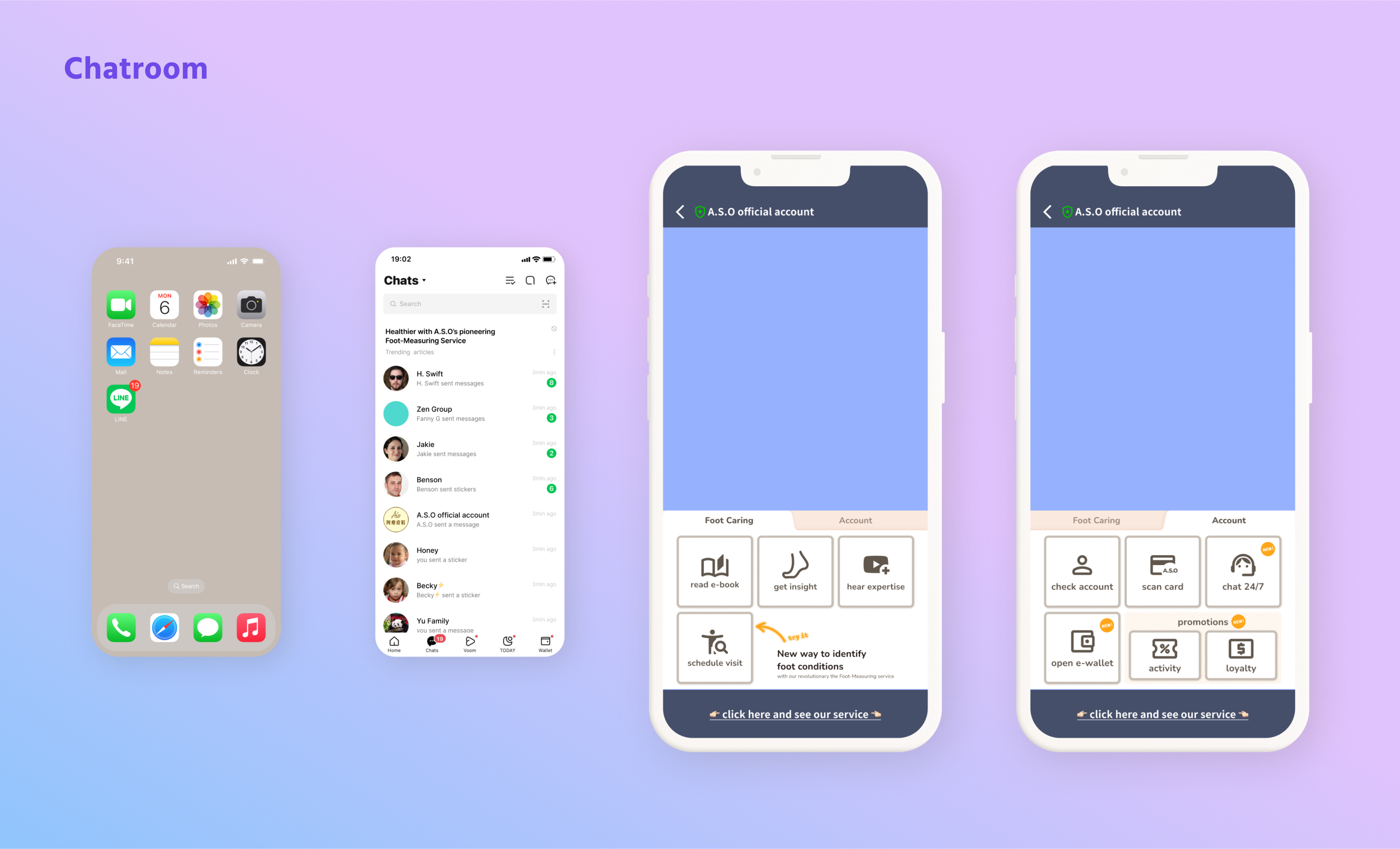
However, due to a late-stage notification from the project manager about insufficient development funds, we have prioritized replacing the LINE Rich Menu. Development of the chat bot will be deferred until funding becomes available.
Analyze
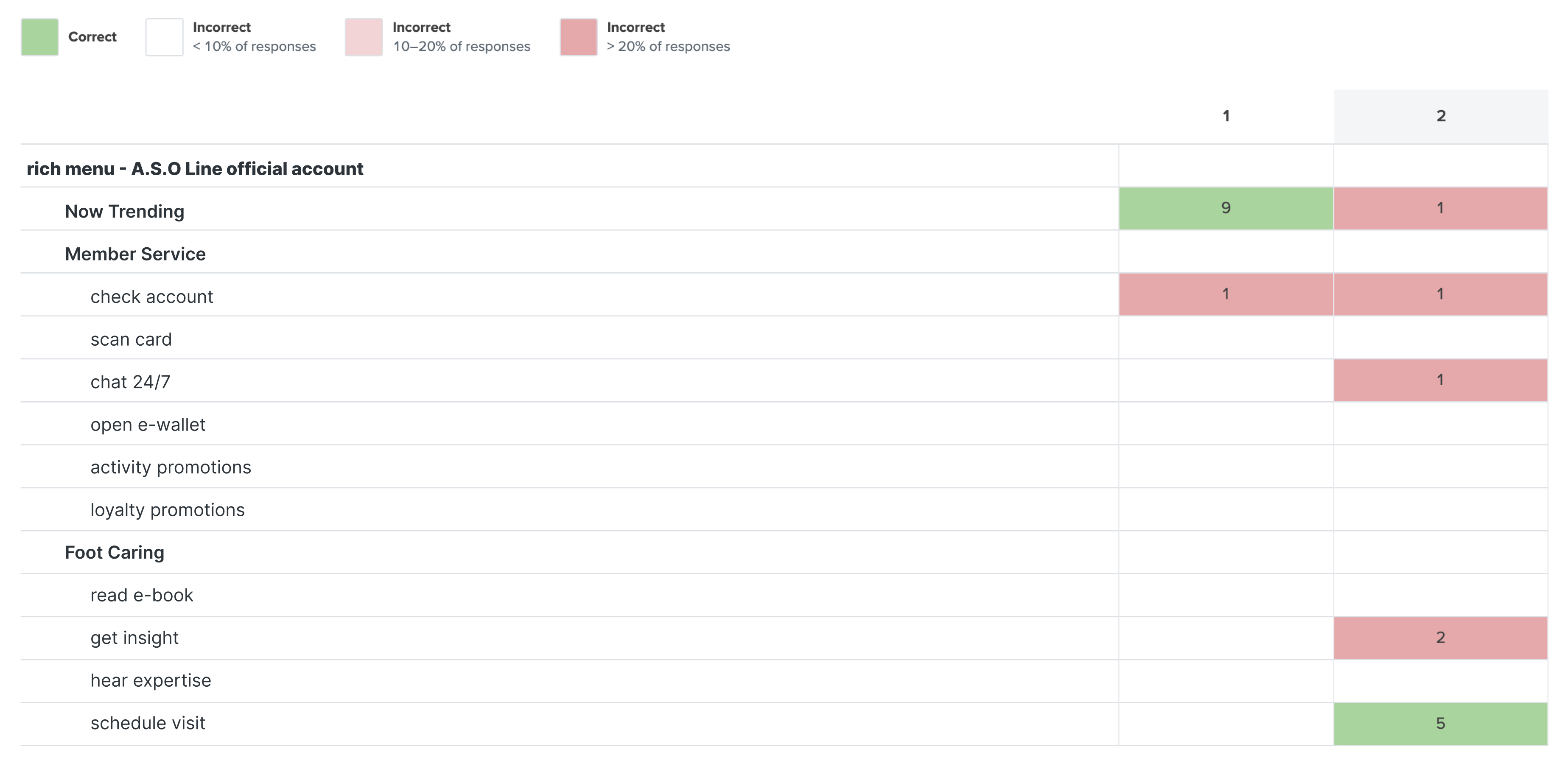
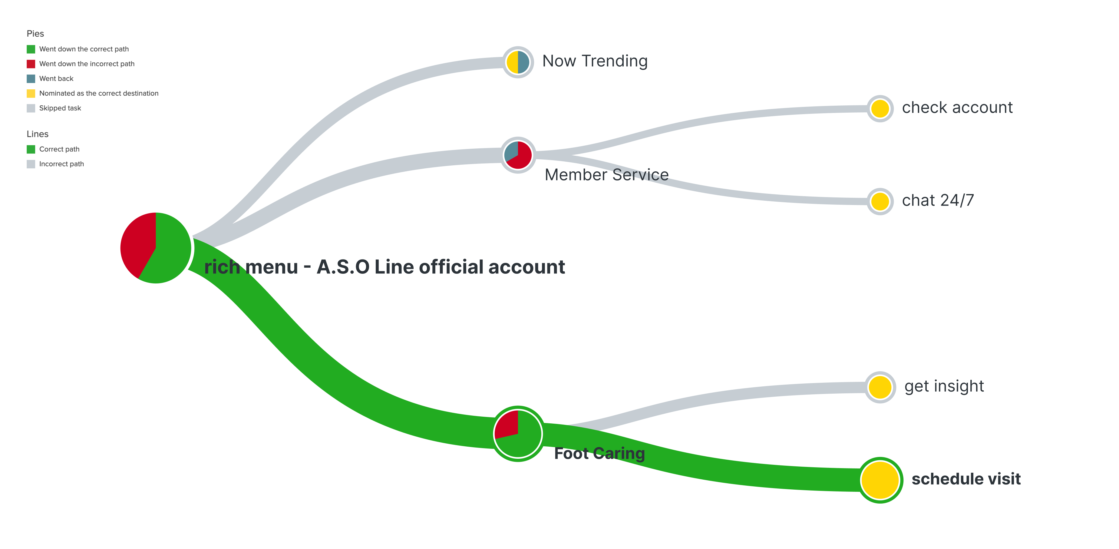
I conducted a tree testing to assess if Gen Z can understand the rich menu structure in the A.S.O Line official account. All participants are Line app users.
Task 1: Locate the latest sales on the A.S.O Line official account.
Task 2: Initiate scheduling for a foot measurement and health assessment appointment.
The results indicate that for Task 2, only 50% of participants successfully located the scheduling feature, with the other 50% navigating to the wrong tab, "customer service." It appears that "customer service" may act as an 'evil attractor,' leading users to assume that the answer lies within this category regardless of the task set.
Takeaways
I collaborated with marketing team to gain business insights and worked with four interns for ideation. Our iterative process successfully reduced scheduling task times. I will continue advocating for resource allocation towards Chat Bot development within the company.
Managing and leading interns for the first time was a great experience, and I discovered a passion for mentoring!